
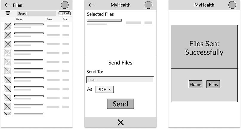
The final design made it easier for parents to find and send health records without second-guessing their actions. Clear buttons and visual cues helped users understand how to select and format files, while confirmation messages removed uncertainty after sending documents. These improvements reduced confusion and helped parents complete important tasks with less stress and more confidence.
MyHealth makes it easier for parents to manage their children’s health records. By simplifying file management, the platform saves time, reduces friction, and keeps parents prepared for common medical record requests from their child's school, sports, or camps.
This project focuses on parents and guardians who are responsible for managing and submitting their child’s health records for schools, camps, or extracurricular activities. These users often balance multiple responsibilities and need to complete time-sensitive tasks quickly and accurately.
I conducted semi-structured interviews with parents to understand how parents find health records and manage their time.
Meet the User
Name: Sarah
Age: 36
Occupation: Working Parent
About: Sarah manages her children’s health records while balancing work, school schedules, and daily responsibilities. She is often asked to send medical documents on short notice and needs a fast, reliable way to find and submit the correct records without confusion.
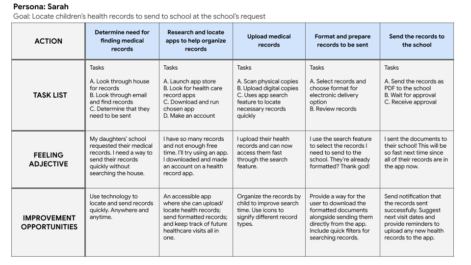
Parents need a clear way to find and send their children’s health records because they are scattered across multiple locations and current methods make it confusing and slow.


After creating an initial high-fidelity prototype, I conducted an unmoderated usability study to test whether users could quickly find and send health records without confusion. Participants completed tasks while I observed pain points and collected feedback.

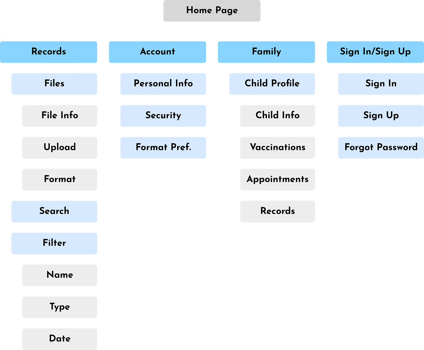
Bad Navigation.
Users had a hard time finding what they need. A simplified home page reduces cognitive load.

Selecting Files.
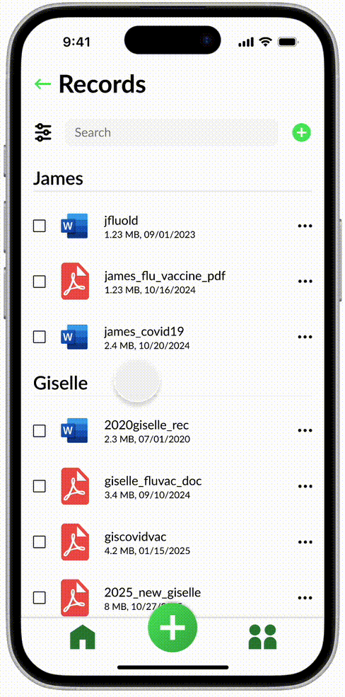
Users were uncertain about selecting multiple files. A clear selection indicator increases clarity.
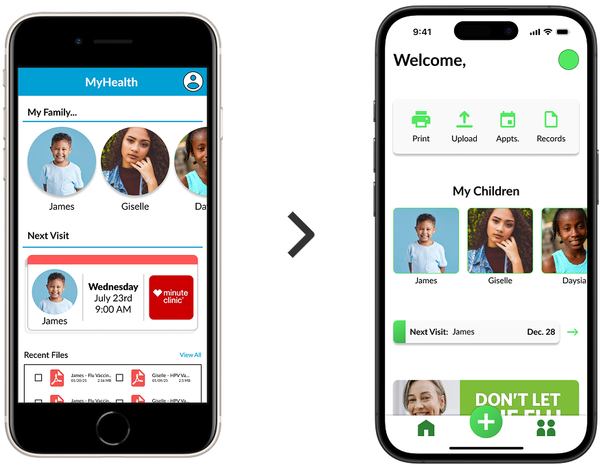
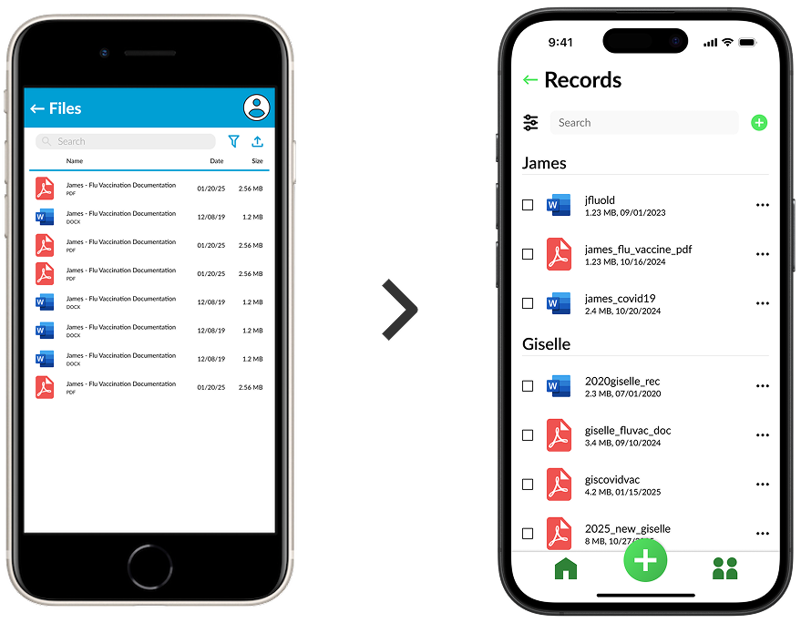
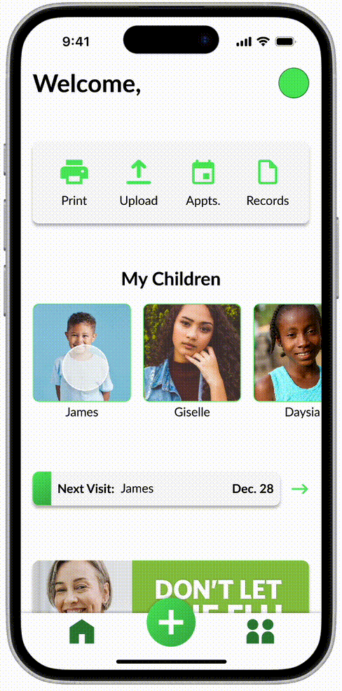
Parents often need records fast, but the process can feel slow when the path to records isn’t obvious or requires too many steps. To reduce friction, the app prioritizes fast access to a child’s records through clear navigation and a simplified home structure. The records view is designed to make searching and scanning easy, so users can locate what they need without digging through menus or extra screens.

Submitting records to schools and camps is a common task, but it can become stressful when “send” actions are unclear. To make sharing easy, I utilize the current devices sharing feature. The goal is to minimize hesitation through familiarity; making it easy to share records.
Formatting often becomes a hidden or confusing step, especially when users don’t know what version the school needs (PDF, specific form, etc.). To simplify this, formatting is treated as a guided step. The design places formatting options in the same place as sharing, reducing steps needed before sharing records.
My biggest takeaway from this project was that clarity matters more than features when users are under time pressure. Parent interviews and testing showed that small friction points like unclear selection states or hidden actions quickly lead to hesitation and confusion. Iterating on navigation, action visibility, and confirmation feedback helped create a flow that feels more reliable and easier to complete. This project improved how I turn research insights into focused design decisions.
